On 20th September 2001 I was invited to a press
conference for a Roger Dean Art Exhibition at 28 Cork Street, London 12th-24th
November 2001. Roger was very chatty so I decided it would be worth transcribing
what was discussed. The questions were mainly from Jon at the Record Collector
(he tends to be the knowledgeable art questions) and myself (I tend to be the
off the wall dumb questions) although some came from Roger’s agent/DVD label
Classic Rock Legends who are currently in the process of producing a DVD
biography of Roger.
There was a brief introduction from the label
and they mentioned Roger’s fine Art Prints. Roger was produced fine art prints
as follows
Tales of Topographic Oceans
The Magician’s Birthday
The Yes Logo
Arches (Morning)
Arches (Mist)
Dragon’s Garden (Mist)
Dragon’s Garden (Sunset)
All the prints were on display except the
Dragon’s Garden once and these also came in two variations of colour.
What are Fine Art Prints?
RD –I know that people have enquiring about the fine
prints and they just think they are posters on more expensive paper they are
in fact a lot more than that though. What I did with all the prints was go back
to some of the themes I had worked on in the past and I redrew every colour.
If you consider the ‘Tales of Topographic Oceans’ print I redrew every single
colour and it is not a 4 colour separation it is about 40! So every single colour
on that was hand drawn and it is not just a question of doing the 40 drawings
because they all had to be absolutely in sync in order to print them. It was
a massive reworking and ‘Tales’ is in fact quite like the original.
Did you work from the original drawings or are
they brand new?
RD – They are brand new. ‘Tales’ is very like the
original but if you look at say the way the rock on the right is drawn compared
to the original you would see it is quite different, but the position of the
rock is still pretty much how it was. Everything was hand drawn and everything
had to be in sync so it is probably fair to say there was probably 5 or 6 times
as much physical effort and time taken compared to the original painting. There
was much more effort involved. It was a lot trickier to but it gave me a big
chance to change things I wasn’t quite happy with on the originals so for me
it was a good excuse to make discrete improvements.
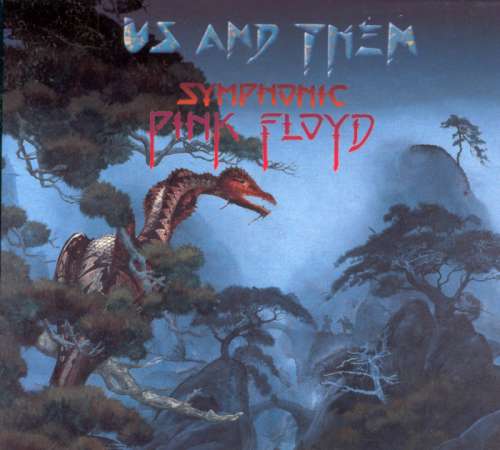
Dragon’s Garden – Original Album Sleeve
After I finished ‘Tales’ and I started on say the
‘Dragon’s Garden’ the original painting for that which was for the Pink Floyd
‘Symphonic’ album. That was a huge wash of very liquid acrylic and as it dried
it made very interesting patterns, which gave me incredible freedom, and looseness
is not what you typically associate with silk screen prints. I thought that
I badly wanted to still get that effect on the new print but it is not controllable.
On the original print the way the patterns appeared on the board and the way
I structured the painting was very dependant on the way the paint dried. Sometimes
I plan a painting in great detail in advance but in that particular case I did
it very loose and I was very interested in the accidental patterns on the paint.
So I had a problem of how to get that on a silk screen painting. Basically I
ended up going the same way. I worked very loose and wet on the film and then
restructured the print around the structures in the drying of the inks. That
therefore meant there are bigger changes in Dragon’s Garden compared to the
original. It has the same colour and feel but the position of the dragon and
the mountains are very different.
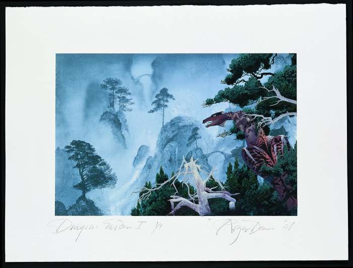
Dragon’s Garden – Mist Version 1
‘Tales of Topographic Oceans’ was the first print
and is probably the most careful balance compared to the original.
Is the sky on “Tales” different? I can’t
remember the sky being that bright
RD – Have you seen the original painting as
opposed to the album cover? No? Well you see the problem with an album cover
is that is it printed in very thin ink in 4 colour separations. This is print
is very rich colours and there are 40 of them. You get a great deal more depth.
In terms of the range of colour this is much more like the original than a four
colour separation can be. When you print in 4 colours you know that you can’t
get the full range. For instance, as a rule of thumb, you can only get 60% of
the blues in a four colour process. So by choosing each colour rather than mixing
them the chances are that I will get much closer in terms of richness. I wasn’t
trying to make it exactly like the original. I was trying to get what I wanted
to get when I was doing the original.
It is nice to have a chance to re-work these
things
RD – The problem I had was there were two things
happening at once. The people that bought these paintings on poster particularly
in the USA were students because "Yes" originally appealed to the
campus audience. I have had 1000’s of requests for the posters and things but
from people that didn’t really want posters any more, you know they have grown
up and they want something with a bit more substance. So I thought we could
do this as a response to that. It was also based on the fact I didn’t really
want to part with the original paintings even though “Tales” was a very high
price. I think the original of Tales was at a $600,000 but I still didn’t want
to part with it. Doing this allows me to sell the prints 270 times at much cheaper
and more accessible price. I guess was the commercial motivation for the paintings
for me, but the paintings, for me, also have much more meaning. When Yes went
to play in Japan in 1973 I had just finished working on “Yessongs” and we were
flying out from Alaska. On the plane we got talking and I had always been very
interested in feng shui. I first came across it in the 50’s when I was a child
in Honk Kong. I had also worked with John Michell who wrote “View over Atlantis” which was a book about lay
lines and dragon paths and stuff like that. So by 1973 I was very enthusiastic
about it all and I was sitting next to Jon Anderson on the plane and I just
couldn’t stop myself talking about the significance of landscape, the power
of landscape and the magic of landscape. In landscapes there are pathways and
I think of these pathways as both a metaphor and an image of a search for spirituality
both in the path and the world it is depicting. Paths help us explore landscapes.
Paths have always fascinated me and always meant a lot to me. I have thousands
and thousands of photographs of pathways in mountains and desserts. It has been
a big obsession of mine for about 40 or 50 years.
Tales of Topographic Oceans – Fine Art Print 2001
Anyway I was telling Jon Anderson all about this
and the poor bloke couldn’t get a word in edgeways. I think this discussion
was the origins of the “Tales of Topographic Oceans” album certainly for the
painting but also think the music too because Jon was very intrigued by all
this and he came up with the title. “Tales” was a spooky picture because to
me it was taking portraits of rocks. These are all real rocks. And they all
had a significance some of them were on dragon lines, which in England are typically
marked by churches, named after saints typically associated with dragons such
as Saint Michael and Saint George. But the rocks are as I say portraits and
they are typically associated with these land lines. Some of them are very weird.
Just as I was finishing this rock (I think it was the rock on the left)
my wife’s father died. She went up to sort out his affairs and all she came
back with for his life was a box of a few letters and photographs but right
on top of the pile was a picture of him standing next to that rock because that
rock is part of the ring at Avery???. And he was actually standing
with it in that view and I thought it very strange coincidence because he could
have been standing on the other side of it for instance. But to see him standing
there with it at that angle was quite spooky for me.
I suppose “Tales” was there most controversial album
because it was a time where “Yes” took that one step beyond their audience.
It’s funny actually because I can remember going on tour with them and watching
them play it and it was hard work. Then a couple of years ago I took my young
daughter who was then 11 years old to hear them play. And the things is if you
start with very good musicians and they don’t wipe themselves out with drugs
and drink or whatever with thirty years practice they get very, very good and
they were very, very good. I was amazed how well they played and then they played
a couple of pieces from “Tales” and I thought “Oh no. She isn’t going to put
up with this”. And as it happened she did think it was boring.
Although there are some sublime moments on the
album the whole thing is..
RD – Yes I was going to say now they play it in the
way it should have been played in the 70’s. They now know it and they know it
intimately. They know how to work around it and now it is very impressive.
Anyway back to the prints I guess the thing I was
saying was these are multiple originals in a sense. They are intended to exist
as prints they are not really meant to be productions of the paintings. That
is what a poster is. These are new pieces in their own right and they do vary.
Dragon’s Garden – Mist Version 2
I don’t know if you remember the Symphonic Pink Floyd
cover but the original does have the kind of feel I have in the prints about
it. What I was able to do with this fine art project was play. Doing a painting
you don’t get as many chances but with the prints I did another version without
the dragon. I then changes the colours and again tried without the dragon and
then I kept back about half a dozen of the prints to rework them by hand with
a paintbrush you know just to paint over them so it was a chance to really get
it out of my system.
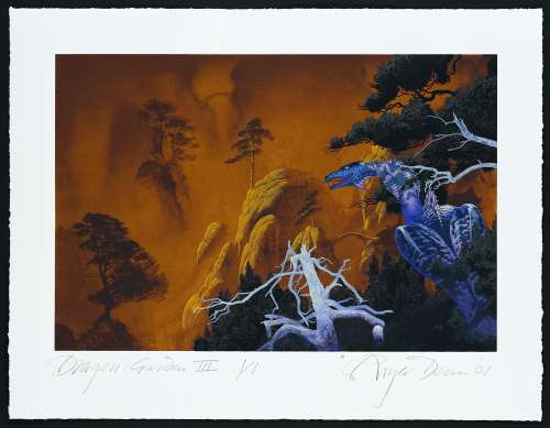
Dragon’s Garden – Sunset Version 1
The original was weird because I had started work
on a big 6 foot by 4 foot painting and Rory Johnson who ran Phillips Glass’s
point music label in New York put the album out and he wanted me to explain
what I was going to do and I had this idea of this storm in a landscape with
a dragon. I showed him this painting half finished and he couldn’t make any
sense of it at all. Since it was talking a long time to complete I decided to
do him a quick loose version and he was sold on that loose version. He didn’t
want anything else. So I guess there are now four of five different paintings
as well as four or five different prints of it. So as I say that is now well
out of my system and I don’t think I will go back there again!
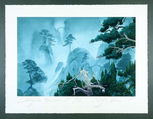
Dragon’s Garden – Sunset Version 2
The other thing I did besides these, which are quite
complex silk screen prints, was a series of logos. The way I do logos is to
draw them and then scan them into the computer and mess with the colour. I did
that with a number of logos for Yes and Asia. The beauty is doing a logo for
me is you can do a drawing and the experiment with colour variations. They were
good fun to do and I expect they will probably be on display at the exhibition
too. They are quite small and some of them are quite cheap too. The logos are
part of my work as much as the paintings and prints. I had a lot of fun doing
them. For me they are like doing a Chinese puzzle. When I am designing something
weather it be a plan for a hotel or a park or just a logo, it is the business
of marshalling all the different elements and getting them to work aesthetically
then giving them an identity and making them stay legible that I enjoy. There
are lots of twists and turns and it is terrific fun actually.
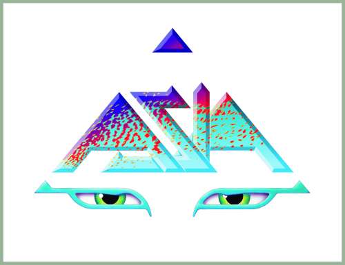
Asia Eyes – Blue
So you build a kind of prototype? Part of your
works seem to be with `camouflage, the putting of coverings on things so if you
do an Asia logo you have the basic thing and you can play with it endlessly.
RD – Yes you are right actually. It’s funny no one
has ever said that to me before except my brother and he was saying the problem
with camouflage is it works, you can’t read it anymore. You can’t see what it
is. I have had that issue with every logo I have ever done. I remember John Colange??? when I did the first Asia logo said “No. It’s not readable.”
Fortunately I made to the following argument to the band, and they backed me
on this, which was unusual as by and large they usually gave in to John Colange???. I pointed out to them that they don’t know who you are now
but you only have to have one album out and everyone will know who you are.
You are not introducing the idea of the name for the whole of your career. You
only have to do it once.
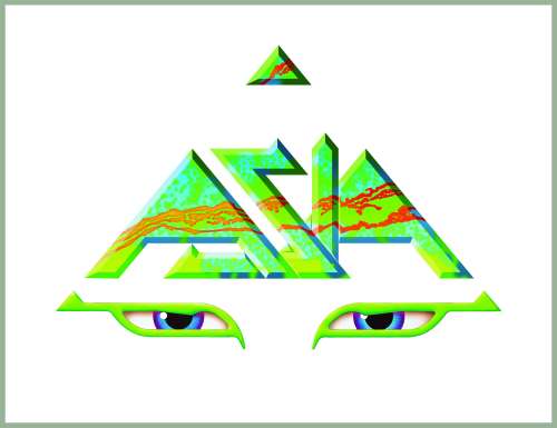
Asia Eyes – Green
The point of a logo is to have it memorable more
than legible. And it is legible anyway. It is not a struggle to read it. I always
think if it takes half a second longer to read you have paid that much more
attention and it is rare that it takes that much time as people will normally
get it. If you happen to be a Yes fan and there is a concert announced and it
is down in ordinary type no matter how big you don’t get it until you come to
that part of the page. But if it is the logo you get it immediately even though
you may not even read it. So these things don’t just work on the basis of legibility
and of course the more you go for legibility the more you detract from interest
and character and it is always a nightmare.
That is quite a commercial sensibility in a way
isn’t it? There always used to be this thing of creative verse commercial and it
has gone now.
RD – I have never had the problem of being commercial
or creative because if I had worked on a commercial basis I would never have
done what I have done anyway. Nearly every record company marketing department
wanted legibility and portraits and that is pretty much all. The beauty of working
with a band like “Yes” is “Portraits? Give me a break”. Portraits wouldn’t do
them any good at all. I can’t imagine any boy band will ever come to me for
a cover. They are all about portraits so I was really pretty much free to develop
whatever I wanted. I was asked recently what the most important factor in getting
my work out was and I said it was basically unsophisticated clients. The few
times I have been approached by an advertising agency have been a disaster because
they know what they want and they know how they want you to do it. Basically
it is rubbish because the only thing that I have to offer is the original idea.
The technique and the execution are good but I can find 10 people that can paint
as well as me. But I couldn’t find 10 people that would come up with the same
ideas. So if an advertising agency is coming in with a pretty much fixed idea
it is hopeless. We do actually occasionally have that trouble with musician
too. I think how I would define being commercial is doing things that you don’t
want to do for the money. But there is another definition of doing things that
sell but “The Beatles” would sell but not think they were doing it for the money.
They are gladly getting the money but the motivation for doing it is not the
primary objective that comes afterwards.
I have done what I wanted. The first album cover
I did back in 1968 was for a band called Gun it was “Race with the Devil” and
the management company was Ronnie Scott’s Jazz club and as a consequence of
that I had maybe a dozen album cover jobs that were all Jazz covers. They were
very graphicy and “I thought I don’t want to do this” and I had to pretty much
start from scratch and say “OK I am not doing this anymore” and I just did pictures
I wanted to do but it meant I had about 6 months in that year where I didn’t
earn a thing and it is very hard financially. Then I got the Alsa Visa ??? job which was my restart and from then on I have only done what I wanted to do and it has worked.
This exhibition is mostly going to be about the prints.
There are about 18 prints altogether. Most of the following original paintings
will be there too
Polanski’s Macbeth (painted for the film of the same
name)
Demons And Wizards (the cover of the Uriah Heep album)
The Magician’s Birthday Party (again used for a Uriah Heep Album)
Escape (Used in Yessongs by Yes)
Arrival (Used in Yessongs by Yes)
Awakening (Used in Yessongs by Yes)
Pathways (Used in Yessongs by Yes)
Octopus (Used in the album by Gentle Giant)
Greenslade Hermit’s Cave (I am assuming this is the band and title)
Arches (Mist version) (Used in Keys To Ascension by Yes)
Acoustically Driven (Used by Uriah Heep on their recent album)
City Spring (A painting planned to be used by Uriah Heep on in the future)
Paladin "Charge!" (I know no more on this)
Sailing The Sea Of Light (Used on the Sea of Light album by Uriah Heep)
Blue Demon (Gravy Train)
Yesshows (Used for Yesshows by Yes)
And I am also bringing between 5 to 10 of the bigger
6ft by 4ft paintings. So it will be quite a cross section of the work going
back to the early 70’s but also including some paints from the last 2 or 3 years.
I think I they way I would describe my work is the same as I would describe
Yes’s "Thirty years practise and you get better at it." So although
the early work has a certain resonance for people that like that kind of music
I feel (and of course I would) the more recent work is better.
Do you feel you are tied into the Genre of music
completely now?
RD – It is very interesting because the way I would
answer that if I was in a playful mood is to say I am most associated with “Heavy
Metal” not that I do it. But the people that copy me copied me for “Heavy Metal”.
I suppose the answer is not really. I suppose about a third of the things I
have done over the last three years have been new experimental bands going in
a quite different direction and bearing no relationship at all to progressive
or classic rock. They are definitely into new areas.
Can you name some?
RD- Well about the most obscure band I have worked
with recently was “Space Needle” from New York. Have you ever heard of them?
No? Well their mothers have. I like working with Youth and Jaz a lot and I would
like to follow that up more in the future. Youth (aka. Martin Glover
) has produced for bands like Deep Forest, Enigma, U2 and even Paul McCartney.
Youth and Jaz were in a band called “Killing Joke” and Jaz Coleman only sings
with “Killing Joke” but he composes and arranges. He is composer in residence
for the Prague Philharmonic, which of course is a long way from Punk Rock, but
they do a lot of experimental stuff. They did two pieces of music for
a computer game I was working on which is still to come out but that was quite
interesting. It was an all round interesting experience as we were both working
from scratch. When I work with say a band like “Yes” the only information I
tend to get is from few conversations. If I am lucky I will hear a few snippets
of music. I spent 3 days in the Studio with Yes on the Ladder album and all
I got to hear was a bass line about a 1000 times. So after three days in the
studio I didn’t have any idea what the album was going to be like. The best
way to hear the album is to get the demos. And for the Ladder that was unusual
as I got to hear it before it came out. Normally I don’t.
So do you ever do paintings for yourself that
bands then use for album covers?
RD – Yes I would say more than half of them are ones
I have done for myself. And in some cases the marriage is amazingly appropriate.
Recently I had a whole series of drawings which were like a gigantic cave type
of landscape. It was supposed to be five or ten miles across in these caves
and I had a painting which was nowhere near finished for a long time. I was
desperate for a reason i.e. time or motivation to get this picture finished.
And then I was given Rick Wakeman’s “Return To The Centre Of The Earth” to do
as a project and I didn’t have to do much to it except finish it. Other times
I have had the pictures in stock and certainly with “Yes” they have said “Oh
yes we will have that”. I suppose “Tales” was the best example of collaboration
in a sense since both the music and painting came out of that flight to Japan.
“Relayer” was started about the time they went into the studio but I finished
that long before they finished the album and I think Jon Anderson perhaps changed
the title of the album to go with the picture. They didn’t change the music
of course. But some of these superficial things like titles do get adapted.
Did you change the colours on “Relayer” at all?
I think that album is generally considered quite a cold album and you have got a
cold looking cover on it.
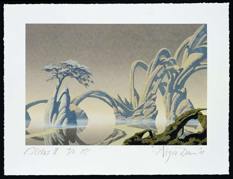
Arches – Mist
RD – No it is exactly how I did it. Some of my work
is very minimal in terms of colouring. This Arches Mist print is like “Relayer”
in that is has a smaller very limited palette.
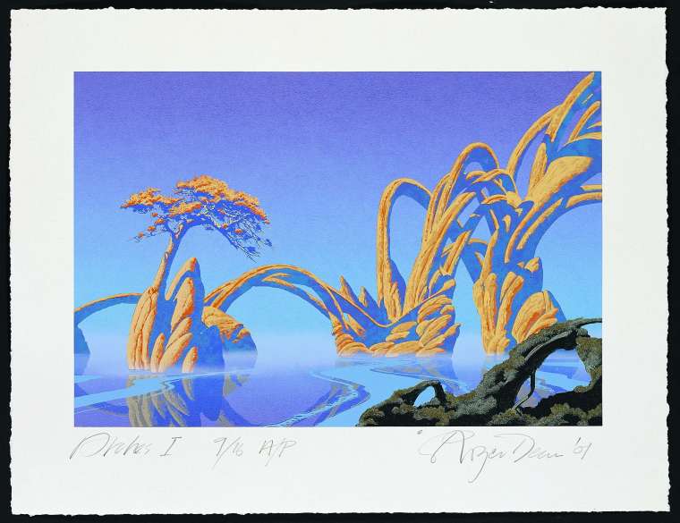
Arches – Morning View
So what are the differences between the two
Arches prints? Is the Mist view the same picture but with less colours on it?
RD – They are probably 90% the same. But the mist
version has actually got more colours on it. For example the shadows on the
right hand arches are all in the same plane on the Morning view. But on the
mist view the shadows are at three different intensities so that there is a
lot more aerial perspective on it. On the Morning view it is in the bright sun
so there is no mist and therefore no air of perspective. It is as I say just
in one plane. So we re-made it. It is the same with the dragon ones when we
did the sunrise one, there must have been at least three or four different screens.
The sunrise one had 6 or 7 different colours. So it is not just changing the
colours but also changing the screens as well.
When you are talking about Silk screening are
you painting each colour that you have chosen separately?
RD – Well the way I work is to paint in black on
film. That is then made into a screen and in “Tales”’s case there are probably
30 or 40 of those ranging from very intricate drawings to ones that are just
a wash. And they do all have to synchronise with each other which is a pain
for me and a pain for my partner Bernard who actually does all the synchronization.
The Yes Logo is archetypal Silk Screen. If you hang it in any Gallery in London
anyone in the art business would recognise that as a silk screen.
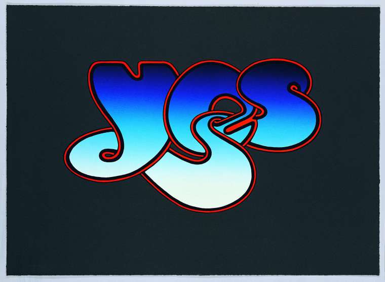
The Classic Yes Logo
Very few people however would realise the "Tales"
was a silk screen however because we have all those very thin transparent colours
on them and that is not typical of a silk screen. It is like a Japanese wood
block. If you can imagine how it builds up from just a few marks, then gradually
about half way you suddenly know what the picture is about but it is very flat
and not very interesting and as you keep adding and adding you get the whole
thing.
I think “Tales” was hard work for Bernard and it
was certainly hard work for me. Basically it was just very hard work!
So how long did “Tales” take and how often do
you have to get the picture made up to see where you are at?
RD – We didn’t really. It was proofed about 4 or
5 times but only to make sure we had the colours right. I think the Dragon one
was probably the longest one taking 4 or 5 months compared to the original painting
which was a month. “Tales” was probably 3-4 months where as the painting was
probably the same number of weeks. It is a different discipline. I think the
thing with a painting is if you don’t like something you just changing it. You
just get some more paint and paint it out. But this, where you have spent so
much time ensure each layer matches and doesn’t block anything else out, is
very difficult. And of course we are not just choosing colours we are choosing
colours that are to be opaque, colours to be transparent and sometimes you make
a highlight by leaving colour off. Other times you make a highlight by putting
an opaque bright colour on it. When you paint a water colour the light areas
are where you put less paint. With an Oil painting you start dark and add in
the light. But with this we were doing both. Some of the colours were so delicate
that when I remember back to the first dragon print with that misty rain swept
sky we probably started with 9 screens. But the problem with that was, with
all the delicacy of the colour, we could never get all the colours to synchronise
and so it always looked slightly out of focus. We ended up having to cut back
to just 4 or 5 screens. So we had to sacrifice some of the colour to get the
crispness of some of the patterns. So it is not a trivial task.
So how many colours did you use on Yes Logo?
RD – Probably 5 or 6. It was much, much simpler.
I don’t mind when it is much simpler. It is not always a sacrifice of intensity.
Arches Morning view was probably only 3 colours put it is still a powerful imagine.
The original of “Tales”???
painting is in the Victoria And Albert museum and the only difference between
this fine art print and the original are the differences I want.
You once said that the animals in your paintings
were very uncomfortable where they were and they were looking for something. Is
that something to do with the Pathways? I think it was in reference to the bird
on the "Yesshows" cover. It seems a lot of your pictures are from one world.
RD – I think there is a connection between a lot
of the "Yes" ones but not all of them. That picture was a very bleak
snow covered landscape and I think that I thought the bird looked lost but I
liked the fact that it actually belonged there. It wasn’t discrete. It wasn’t
a snowy owl or a creature of that climate it just looked outrageous.
I do put animals and creatures in paintings. I like
the idea of the human involvement of the paintings to be the path. It is quite
rare for me to actually paint humans in my paintings. I find that if you put
a person in you immediately have a relationship with that person. If you just
have a pathway the picture isn’t necessarily empty. It doesn’t have an empty
and forlorn feel although some do and that is intentional. But the fact there
is a path draws you in and makes you start exploring. When I was quite young
I came across this idea of a garden with a pathway that wandered around. And
as you wandered around the path and looked in different views you could do your
Tai Chi exercises and get a different view
not just every day but every season. I thought that a meditation garden that
had that level of interaction with someone walking around was fascinating. But
I think the path is a both a metaphor for some kind of path to enlightenment
and also the word we use for the struggle for enlightenment. References to the
path appear in all religions. It is even a metaphor for the way we behave such
as staying on the straight and narrow. I think that exploring a landscape is
an inevitable pathway to enlightenment and that’s why I think it is important
we get into the painting and world in general. And I think human beings have
a role in that. The Chinese when they were developing a lot of their ideas about
feng shui used to think of themselves as God’s gardeners. You know God built
the universe but then put Human beings in to refine it, polish it and nature
it. So it is quite an interesting idea.
As you may know I do a lot of Architecture. There
is not a lot of it built, in fact not a dog knell of it built, but I am involved
a lot in designing it and one of the things you are aware of is no matter how
environmentally aware of it you are the minute you build you are making a mess
on the landscape and a lot of the buildings are designed to have earth covering
them to make them more discrete but inevitably if you build you destroy what
is there. So my view is if you are going to make a mess of it, try and make
a mess of it that will mature into something better than was there before. Now
that is not always possible and in some ways it is an arrogant idea but the
point is if you are going to make a mess make sure it heals in an aesthetically
pleasing way. My view on landscape is yes it is great but we do live here. We
do live on this planet and if there are 5 billion of us or 10 billion it doesn’t
make any difference. Even if there were only a few thousand of us we are always
going to make an impact. The name of the game to me is to make that impact as
beneficial as possible. You can’t make no impact so that is not an option.
Does you inner spiritually not conflict with a
lot of the bands you were working with? Someone said the other day that Cocaine
and Champagne was very much on the agenda back in the 70’s. So did your way of
coming to the images and the way they were coming to it conflict?
RD – I think my spiritual ideas were incredibly common
in the 70’s just as they are now. Some people dabbled lightly and some people
immersed themselves and I am not sure that immersing yourself is necessarily
better than dabbling. I don’t know but it is very interesting. I have a young
daughter that is fascinated with a whole spectrum of stuff. She can be adamant
about the evil organised religion can be at the same time as having an incredible
need to investigate the nature of God. She is enthusiastic about something as
trivial as looking in the paper for her horoscope, as unfortunately the teachings
on Don Juan. I have to take the blame for this as I introduced her to them.
So she will read the one and she will read the other. It is like eating in a
way. If you eat an incredible spectrum of foods when your body is in desperate
need of some trace element your body knows where it got it before. But if it’s
total range is McDonalds it is going to struggle. And I think that is how we
have to look at what the possibilities are. If I push her in any direction it
is just to take time and space to think. For me I can’t think of a better way
of doing it that walking in the country. One needs variety so if we get the
opportunity we travel. Unfortunately when I introduced her to the dessert of
Utah I did it in August and the USA was going through a heatwave. It was about
130 she was not best pleased. I did say to her next time we will do it at Easter
or October when it is Grey. You see Monument valley in all the movies as a dessert
but every year it snows there and I have friends in a place about 30 miles from
there and they describe their winters in terms of the bill for getting a bulldozer
to come and clear there drive. The snow there can be 8 to 10 foot deep but we
think of it as a dessert and of course it is a dessert but it has a cool time
and a hot time. I have been there several times so I have been there when it
is cold and even when it is flowering in the spring time.
For me I think the landscapes that are inspirational
are the American desserts. The Chinese and Japanese traditional landscape paintings.
Scotland. All of them.
I am talking a lot about Landscapes but I guess that
is a lot of what my work is landscape paintings.
I paint Landscapes and do architecture and I guess
the two things I would like to do are to build the architecture then I would
like to walk around the landscapes although obviously rocks floating in the
air would be a bit tricky! I would certainly like to make a film of it and to
that end we have been looking at a number of scripts that would use those landscape
ideas.
Did you enjoy the project you did at the Ideal
Homes exhibition where designed and made a house without any straight lines? How
did it go down?
RD – Yes I did. Well in 1998 when it was first put
on show we had something like 45,000 people walk through it in 5 or 6 days.
That was intense because if you arrived at 10am you had to queue until about
1-2pm to get in. So that kind of took my breath away. I suppose over the course
of 1998 70,000 or 80,000 walked though it. We had over 1000 enquires from people
wanting to build one which again was nice.
And did anyone?
RD – Well I am told we will be making an announcement
before the end of this year about a small little complex containing accommodation
and an environmental education centre. It could be as early as the exhibition.
We will also be announcing a park in Malaya. So keep your fingers crossed for
me.
Whatever happened to the Brighton Hotel project?
RD – Nothing. What happened was we made very good
progress, we had lined up operators and finance etc and then at the very last
minute the Marina company which was own by a bunch of banks would not put the
project before the board. We never found out why so it just died a death. I
guess it was our first shot and doing something like this and we were pretty
naive. Hopefully next time we will do it better. Through the 80’s we had a lot
of projects that never happened but by and large we were paid for them. There
were only a couple like that one which we self financed and therefore lost out.
Would you describe you work as futuristic?
RD – The problem with that is that we have a very
limited idea of the future, which is driven by hard edged architecture and technology.
I would say my work is futuristic in the sense that it doesn’t exist now and
I would obviously like it to exist.
Components of it exist now though because they
are taken from organic things that do exist on this Earth now
RD – Oh sure. So in that sense yes but I would like
to build stuff like these paining and personally I would like to live in a world
like this.
They could be considered futuristic in the sense
they are not possible. IE the rocks floating in thin air.
RD – A lot of the picture I do are 90% real and it
is just that little tweak that makes them not. For instance on one of my pictures
there is a lake but it is not a reflection you see. You are looking through
it into space so there are small elements of the pictures, which are unreal.
What was your round house constructed from?
It was intended to be made in sprayed concrete and
ceramic but the prototype which was built on the back of a truck and had to
tour lots of exhibitions was made of fibreglass,
It has a very good insulation property doesn’t
it?
RD – Yes it does.
Is it used for anything now?
RD – It is used for insulating steel buildings from
fire. If you go and look round the structure at Victoria station you will see
it is sprayed in the same stuff. The world trade centre also used it but it
was just to thin a layer. It was insulted up to 500 degrees when it needed to
be up 1000. It is used for building water towers and dams all kinds of things.
How did you come across it?
RD – Many years ago when I first came out of college
William Willard who was a TV presenter on “Tomorrow’s World” was very interested
in it and he said he wanted me to meet someone who could build this structure
with something he had investigated.
Have you ever wanted to do a non-Roger Dean type
painting? IE Have you ever felt boxed in by your own success?
RD – No. I do lots of drawings that are different
to this.
Does it annoy you that this is the way you are
perceived or seen and there is all this other stuff you do that is less well
known?
RD – No. I am very grateful that the albums covers
are seen and well known and there are always other chances to show people other
stuff because of it. What kind of work did you have in mind when you asked the
question?
Nothing specific I just know that some musicians
feel tied to the sounds they made when they had their most successful period and
I wondered if it applied to artists too. Would people reject something because
it wasn’t Roger Dean enough?
RD – Not really. I am often asked the opposite actually.
I am given a project but told that it can’t look like “Yes” or whatever. Unfortunately
in a sense it looks like me because however differently I do it, it is hard
not to be yourself. But I don’t mind that. If I am experimenting with stuff
and it works it normally gets used. For instance I was very interested in Calligraphy
I don’t mean handlettering I mean marks made at the speed of writing. There
is a beauty to writing that is different to the beauty of paintings and I had
a friend called Rick Griffen who used to paint as if he was writing and all
his painting had a kind of elegance as if he was so familiar with it he had
done it a 1000 times before, even on entirely new projects. I was really interested
in those kind of speedy marks but wanted to do them with something other than
pen because pen has very little character. I was therefore experimenting using
the technique with all kinds of stuff from scrunched up paper to bits of wood
and stuff. And a lot of those experiments I used on things like the Yes Box
set i.e. on the CD’s inside it. If I play and have fun and it works I tend to
use it.
Is that the Rick Griffen who was in Grateful
Dead?
RD – Yes he did surf type comics back in the 60’s.
He worked on Zap but he really was an artist and a great one really.
The Grateful Dead had a really good album
cover for Aoxomoxoa
RD – Yes I totally agree it is brilliant. It was
a huge influence for me because I bought that before I had a record player just
for its cover. It was very inspirational because at the time graphic design
was taught in an incredibly restrained minimalist approach. It was really boring
stuff.
What did they train you for?
RD – I didn’t do graphics, I was just observing but
they were training people for books posters advertising or whatever. But when
I saw that of Rick’s I thought “well there really are no rules you can do anything
you like”. I collect stuff so if I see an olive oil can which is painted in
amazing iridescent colours because they are printed in transparent ink on metal
I am likely to buy it just for my collection. I saw an amazing gallon can of
Soya sauce in Japan and I bought it and got rid of the Soya sauce just because
it was fabulous. I thought Rick’s stuff looked like he might have gone to some
kind of weird unknown civilisation and discovered this thing. It looked complete
but alien. Rick was never really talkative about his work. I knew him on and
off for nearly 20 years and I don’t think he ever talked about his work. Not
to me anyway.
Have you ever rejected a project because you
haven’t liked the lyrical content of an album?
RD – I don’t normally know the lyrics in advance.
OK how about if say Marylyn Mason wanted you to
do a cover would you be put off?
RD – I don’t recall it ever arising but I don’t like
everything equally. I wish Led Zeppelin had asked me to work on their third
or fourth album because I think both of those were unbelievable but unfortunately
they had covers already. There have been covers I have worked on where I haven’t
liked them that much.
But you have never not wanted to be associated
with something?
RD – No. Not in advance anyway. Sometimes afterwards.
What are you thinking off?
Well one of your rivals once turned down a Praying
Mantis album because he didn’t like their view that the world was heading into
doom and gloom.
RD – Ah yes I heard he got born again and ruled out
any reference to Satan. I used to get very irritating with his copying of things.
His first job if like the launch of his career was with Bigo??? posters when I wouldn’t do Fragile as a poster. They wanted
more posters off me than I could do. And in particular they were pressing me
very hard to do “Close To The Edge” and “Fragile” as a poster. But I wouldn’t
do them, as I didn’t feel they would stand being blown up to the size of a poster.
The originals were only small. In the end because I wasn’t producing much I
gave in and let them do “Close To The Edge” and it sold well. I think it sold
about 1.25 million in a few months. It was probably quicker than the album.
That proved to them that they were right and I was wrong so that the campaign
to get “Fragile” out as poster was really big. I just didn’t want it to happen
though as the original was only a tiny painting about the size of an album cover.
So what they did was commission someone else to do a Fragile inspired poster,
which pissed me off enormously. This artist then went on to do his take on others
including “Relayer” and I thought, “this is appalling”. So I told Bigo
this must stop. And they said “Oh he is such a nice guy you should meet him”
And I said “You know the last thing I want to know is that the guy that has
just burgled your house is someone that has 7 kids and is really a saint. I
don’t want to know. I want him to stop and I want you to stop encouraging him”.
And they didn’t so I ended my contract with them. But the situation arose again
some years later and the publisher then came to me and said “would you mind?”
and I said “Yes I would”. And they said “Well would you do anything about it?”
And I said “I might!” I later had representations trying to convince me he didn’t
copy that and he got his inspiration from this and that and the other. And I
said “Let me put this to you. I haven’t named any works you have just rung me.
Secondly I know these pictures if he was inspired by anything other than mine
why didn’t he do it before me? Why did it have to come six months later?”
I think my concern with lyrics is often more that
they are sometimes so naff. I am sure Satan wouldn’t have anything to do with
them.
So no I don’t have that kind of issue. I might but
it hasn’t arisen so far.
So do you keep a breast of other artists doing
album covers in your style then?
RD – No it annoys me too much. There are a number
of artists that have build their careers doing copies. I could never really
understand why people caused themselves the embarrassment of copying since everyone
knew what the did and it is not considered particularly smart amongst other
artists so they would probably get a lot flack from other artists besides me.
There was another guy that basically launched his career on one of my pictures.
He must have done about 20 or 30 variations on one of my pictures and I do occasionally
sue people. I consider it basically like any other kind of theft. Kids do it
at school but that is nothing. They are not trying to sell it, they are not
making a living out of it and they are not necessarily pretending they invented
it. What so annoyed me was that they used to deny it. I was even once sent a
packet of photos about the version of “Relayer”. There was some rock formation,
which was very like it, and I was thinking, “Yes this is very like it but your
picture is exactly like mine”. So no I don’t follow what others are doing.
Have you ever produced books of your work?
RD – Yes I have done two books. They were both best
sellers but they were books so they sold a lot less than posters but the first
one did about 1.25 million and the 2nd one didn’t have as many painting
so it did probably about 600,000.
So was this a long time ago?
RD – Yes the first was about 1976 and the 2nd was
about 1984. The third is likely to come out in perhaps two years.
Are the first two books currently in print?
RD – They are about to be reprinted. We are currently
in discussions about that so I don’t think they are likely to appear before
Christmas. There is also a DVD currently being made by Classic Rock Legends.
Basically it is Biography and they hope to have that launched to coincide with
the exhibition.
How do feel your work has translated to CD?
RD – That is normally completely down to the record
company. I couldn’t believe that for nearly 10 or 15 years Atlantic Records
put out “Close To The Edge” without the painting. All there was a poor piece
of paper printed in Black and White. Basically there was total abuse of their
customers. There was complete disregard for doing things properly. I had experience
with a small German record company called Repertoire and when he re-released
Gun not only did he reshot from the original artwork he also included all the
original paintings and stuff like that. Anyone buying that is actually buying
something better in every sense even though the size of a CD is smaller than
an LP. Anyone buying an Atlantic “Yes” album from 1981 to 1995 were basically
buying a piece of rubbish and I think it is stunning and outrageous that record
companies could be that abusive off their customers. You don’t get a packet
of corn flakes packaged that badly. It angers me in the artwork sense and it
angers me in that it is not there necessary to be so tacky. The difference between
it being down well and done badly is only 1% of the cost. And as it was they
doubled the prices unnecessarily. A CD is cheaper than vinyl and yet they doubled
the price but still they put it out as this piece of rubbish. That really offended
and upset me. It is still a problem if I dealing with the latest thing I did
for Yes. Left bank??? will put it out the same way there might be a bit more material
and they might print it in colour but it still goes out folded flat in a jewel
box. Eagle might just take the trouble to put it out in a digi-pack and nicely
boxed. And the thing is as we have already discussed Yes’s audience aren’t kids
anymore (not that kids should be ripped of either) but they are people that
will notice this sort of thing and they too will be offended. I think the record
industry is now squealing because the people can now get hold of music without
buying any individual thing. People now have abstract access and I feel the
record companies are now getting their comeuppance. Once upon a time you bought
something and your aunt could wrap it up and it would make a nice present. That
went and once that went the objectiveness of it went too. The technology of
it has wiped it out. I think what will happen is that access to the music will
become increasingly abstract. I there will be a small but strong reinvention
of for instance a “Yes” album as a present with a much bigger emphasis on the
packaging but it will be a smaller part of the music business. Mpg or whatever
will just take over.
Is some of the problem that the record companies
don’t have access to the original masters of all the artwork? Or do you always
retain the rights?
RD – Yes I always retain the rights and the record
companies know what to do they just don’t do it.
So even if you sell the original master painting
you still keep everything required in the process of getting it put to CD?
RD – I actually sell them a license so I keep the
copyright and the original painting.
So you have all your original paintings?
RD – Except when I have sold them specifically or
where on a couple of occasions they have been destroyed in a fire.
Aren’t some of the original paintings currently
for sale?
RD – Yes because Classic Rock Legends bought them.
Not at the time they were commissioned but in the last few years. I have had
paintings for sale in USA. I sell a few paintings every year. I only produce
4 a year so if I am selling 20 a year I will soon run out. There will be some
for sale at this exhibition, mainly the Classic Rock Legends collection. But
I guess although I am interested in selling them, I am more interested in selling
prints. I wouldn’t want to part with too many originals.
When a band comes along and wants a Roger Dean
cover do they have to be wealthy/successful to get you interested now? Or do you
do stuff and license it out and hope for the best?
RD – No I don’t make it impossible for people new
in the business to work with me. It is expensive I will grant that but when
“Space Needle” wanted a cover they didn’t have any money of their own so they
managed to persuade a record company to spend the money. That is normally the
way it is done. Mind you even in Yes’s heyday the never paid. It was Atlantic
that paid so it was very convenient for me because “Yes” would commission me
and Atlantic would scream!
You might have heard of the band Travis.
Apparently the lead singer has been seen wearing a Yes logo shirt on stage. The
recent trends have been for a lot of T-shirts to be remarketed in lets say an
Ironic sense and your work is often seen as of a particular period.
RD – That is very true in England but you don’t get
that in America.
So what do you think about that?
RD –Well those T-shirts are available legitimately
so I guess there would be two issues. Is it a pirate T-shirt and do I mind?
I guess I don’t. I would find it kind of funny really.
Have you seen “Yes” recently? I took some Bob Dylan
friends in American and they couldn’t believe they were going to see “Yes”.
They just went because of me but they were really impressed just by the quality
of the playing. They play really well together. Except when Bill Bruford is
with them because Alan White and Steve Howe always play exactly what they have
rehearsed where as Bill Bruford’s philosophy was never to play the same thing
twice which kept them on their toes some what!
I took my opportunity to grab a couple of signatures
and gave Roger my Returned To The Centre Of The Earth CD and LP.
RD – Do you know I had such a row with EMI about
this. You’ll never guess what they did. They sent the low resolution positioning
scans to the printers so the CD’s are appalling. I said you have got to redo
that “You can’t even see the little figures that give the picture it’s sense
of enormity” and they said “No, no, no. We haven’t got time for that”
On the LP sleeve you can see Graining. Is that
because of the printing?
RD – No that is on the canvas.